Total Pageviews

Thursday, May 19, 2011

1. A good digital artist need to know how to use a computer. Many  of the software required in the animation industry. One of these software include  photo shop. They need to know photo shop so that they can remove the unnecessary items from the photos. They also need to know how to use audacity. They need to know how to use audacity so that they can make a good sound track.


2. The artists used many tools. These tools include the cloning tool; the cloning tool was used to erase the unnecessary background. The digital artists also uses the quick selection tool to select and mask out unnecessary things. They also uses the move tool to move the objects around to make it look more realistic.


Friday, April 1, 2011

Audicity

1) I fu want to get audicity program
        -Project> Import audio
2) Project- Make a new labal track
3) Remember to bring earphones
4) Tools at the top bench press tool is the time shift tool
5) "I beam" is called a selection tool
6) The envelope tool is to click multiple times to squish and lengthen the waves
7) Pencil tool is to shape the wave
8) Multi tool mode- Combination of all the tools

Wednesday, March 23, 2011

How to make a drop shadow for a Ipod

1) Put all layers into 1 folder and name it Ipod
2) Make a duplicate (2x) of the folder
3) Name it shadow and reflection
4) The shadow and the reflection folders should be merged together.
5) Transform and flip vertically
6) Mask the reflection
7) Use the grandiant/Brush tool
8) Have low opacity
9) Take shadow layer and ctrl click on the icon of the layer na dwill give u a selection
10) Fill with black
11) Make it smaller and use gausium blur

Friday, March 11, 2011

how to make a drop shadow

3) Set the resolution to 72 pixels per inch and the mode to RGB color.
4) From the Layer menu, choose New and Layer. Click OK.
5) Select the Paintbrush tool and choose a light foreground color. Paint a shape on the canvas.
6) From the Layer menu, choose Effects and Drop Shadow. Click OK.

Tuesday, March 8, 2011

Layout composition

7 tools of compositions:

Hierarchy: Organizings things from most impotant to least important.
Focal point: The strongest, most compelling element in a design.
Eye path: A strong composition can guide the viewer's eye through design.
Proportion: Size of elements in proportion to one another. Relative amount of space devoted to items. e.g. written vs. image.
Visual weight: The lightness and darkness to a hue
Type as a visual element:
Alignment (grid): A way to align things up , using a grid.

^ design with intention
Use these tools to guide the audience's eye

Monday, March 7, 2011

Friday, February 18, 2011

Final notes yeeeeaaaa!!!

1. Drag layer onto another layer
2. To trasnsform us ctrl + T
3. Zoom out if u cant see handles and hold down shift while moving the handles.
4. When down transforming, press enter.
5. To make brush bigger or smaller, press left or right brackets.
Right click to change diameter of brush

Thursday, February 17, 2011

Notes

1. Space bar, graber tool, navigater tool
2. lack and white: Click the smaller boxes
3. Selections are important because it fills colout to that seleted part
4. Add to selection- shift
Delete from a selection- alt
5. invert- shift +ctrl + I
6. Fill- alt + del
7. Return to selction- Ctrl + click on thr thumbnail
8. Name your layers to avoid confusion
9. Make a copy of the background layer

Wednesday, February 16, 2011

Notes- how to move several layers at the same time

1. Press shift to move multiple layers together
2. If u want to edit the background layer, double click it and rename it
3. Shortcut to fill => alt + del
4. Shortcut to select => Ctrl + click layer (make sure to click the thuimbnail)
5. Name all layers or u shall suffer
6. Slowly turn layers off to fix any errors

Tuesday, February 15, 2011

How to make a drop shadow

1. Use the text toll and write out your name
2. Rasterize the text
3. Make a copy of your text
4.Lock tranparency on the duplicate
5. Edit => Fill =>Fill it with black
6. Turn off tranparency lock
7. Filter => Blur => Gauzium blur => ok
8. Reduce oppacity
9.Put the duplicate under the original text

how to make a blapple

1. Use quick selection tool to select the background
2. Use the polygonal tool to select the tool
3. Invert the selection
4. Click on layer adjustment
5. Click hue/saturation

Monday, February 14, 2011

Notes

Deselect shortcut- Ctrl + D
Hand tool- Space bar
Rectangle/square selection tool- Marce tool (name)
Inverse- Shift + Ctrl + I
Click and drag with the move tool or ctrl c + ctrl v
Click eyeball to turn on and off layers
To get a selection back, hold down the ctrl key and click on layer

Monday, February 7, 2011

Harmony


Harmony is when things go well together. In this color wheel, it shows the different types of unity. Colors beside each other go very well together as to when the colors are far apart from each other.

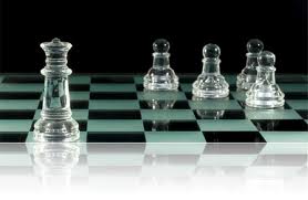
Asymmetrical balance

This picture represents asymmetrical balance. This picture represents asymmetrical balance because there are 4 pieces of pawns on the right side when there is only one bishop on the left side.

Symmetrical balance

This picture represents symmetrical balance. This represents symmetrical balance because if a line was there in the middle of the picture, it would be the same on both sides.

Emphasis

This picture represents emphasis. What I would like to stress on its small body. I am putting emphasis on the body because the body is usually bigger than both the hand and the head.

Proportion


This picture represents proportion. The dog is much larger than the cat is, representing what is bigger and what is smaller. The relationship between the dog and the cat is enmity where they are both fighting showing attraction to the cat.

Rhythm

This picture represents rhythm. This picture represents rhythm because there are numerous types of circles surrounded by an circle and so on.

Color

This picture represents color. This picture represents color because it shows confusion in one's mind as the colors swirl in circles leading in the same spot.

Texture

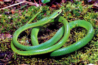
This is a n example of texture. I chose this picture because of the rough scales of the snake. The texture of the snake is rough.

Shape


This picture represents shape. I chose this picture because the black cloud makes an inverted, side fliped image of  'A', 'B' and '2' when it overlaps, so this image represents motion.

Line

This is an example of a line. I chose this picture because it is a bunch of straight lines that form different shapes like a triangle, trapazoid, circle and a semi-circle.